The Challenge — When NeutralEnough Isn’t
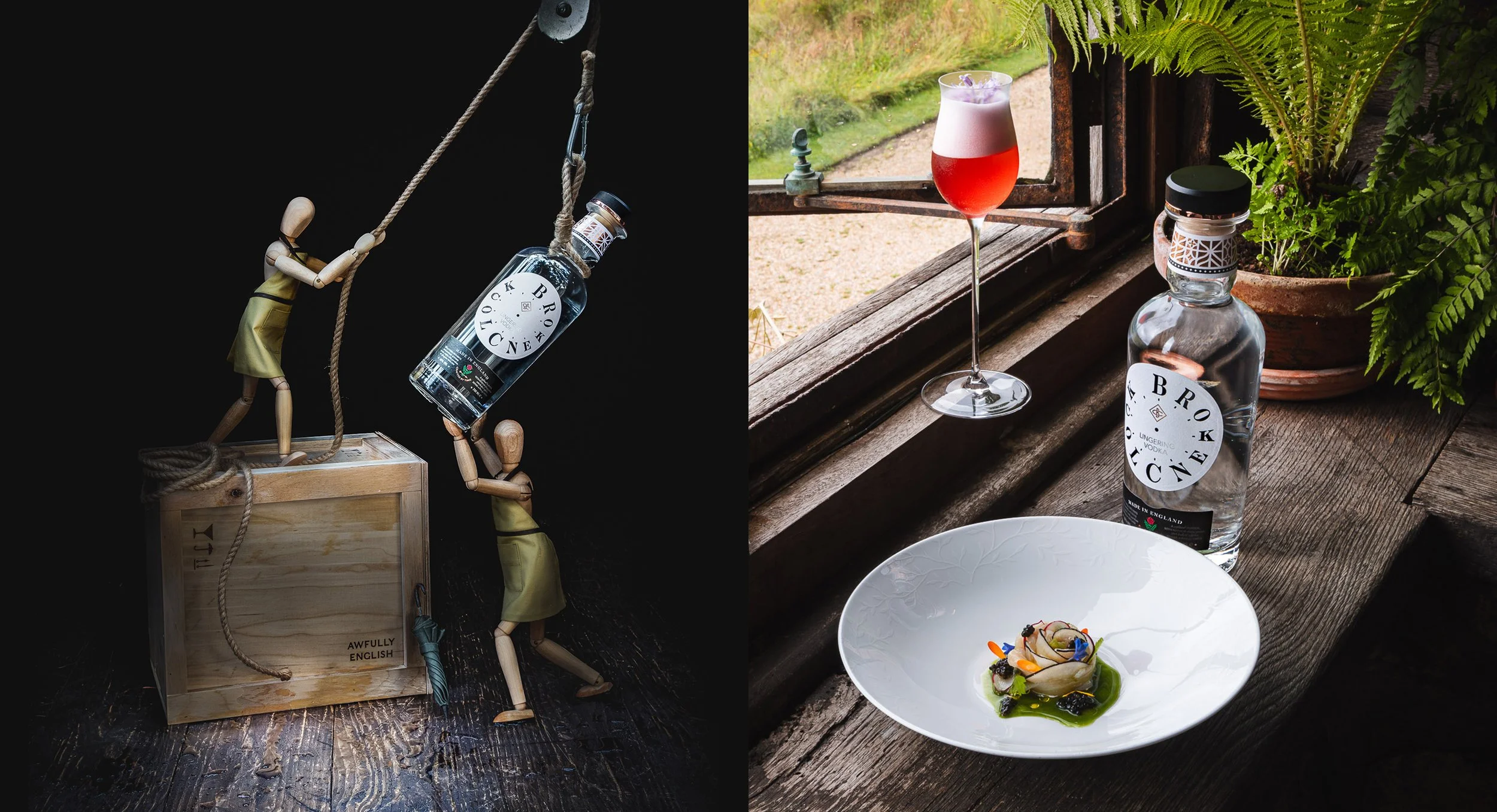
Clean. Clear. Minimal. Vodka’s promise of purity is also its problem. As drinkers trade up for brands with visible character, provenance, craft, ritual, neutrality struggles to stand out or earn a premium. When every bottle gets sleeker, the difference disappears. Broken Clock set a new brief: swap sterile perfection for time, craft, and wit—an English vodka that wears its origin (the North of England) and its personality on purpose.
Our Approach
Build the brand like a story you want to keep.
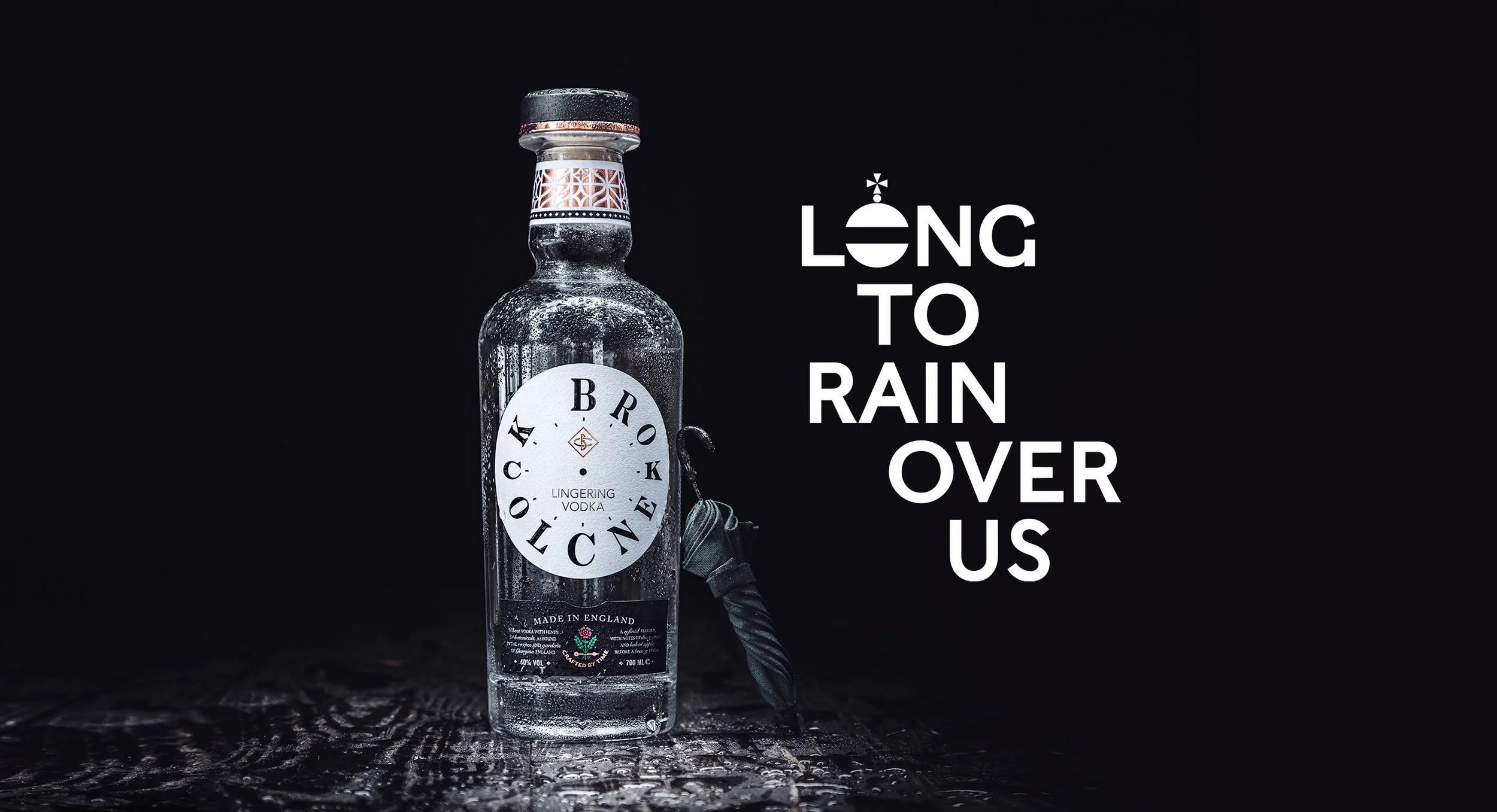
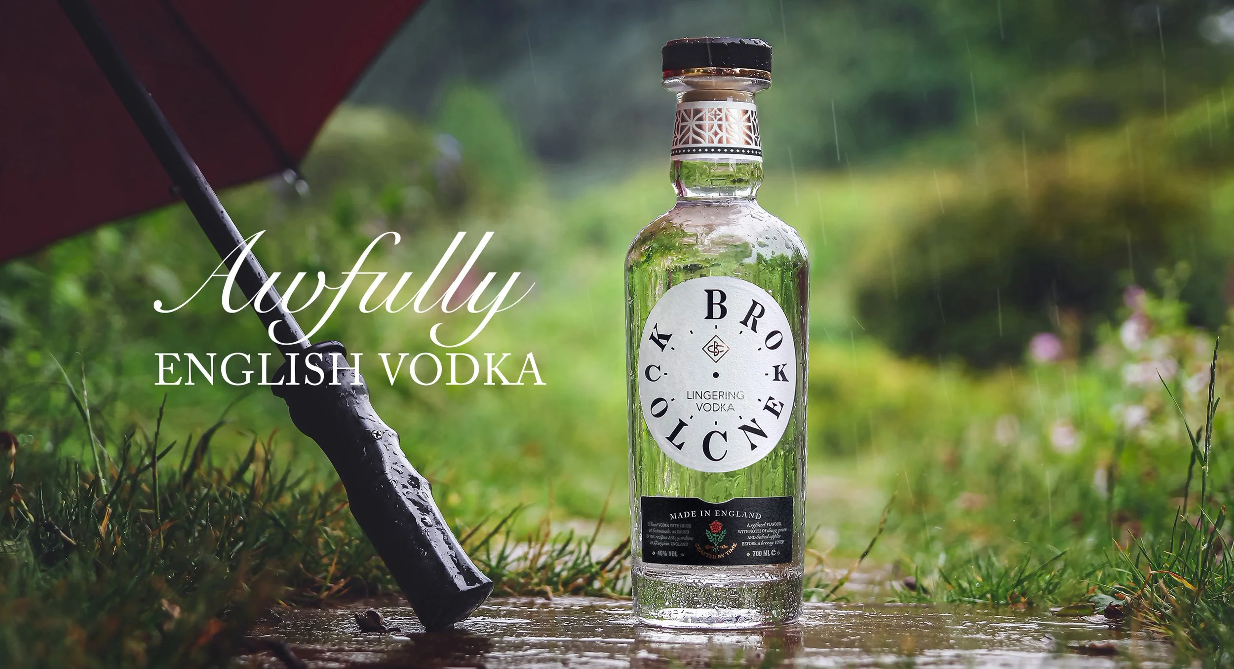
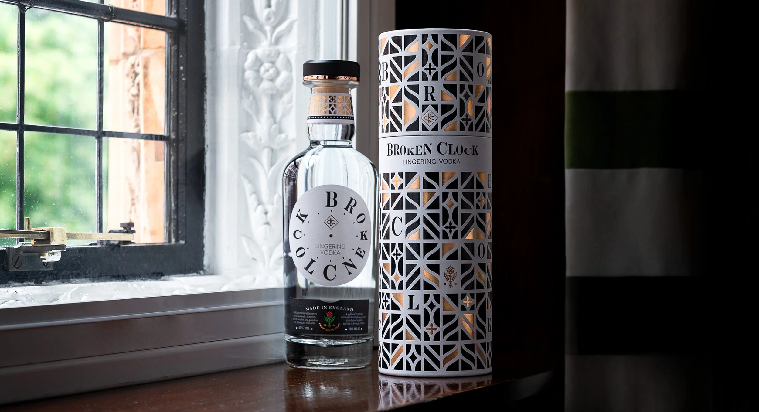
Identity with intent: engraved detailing, period-leaning type, and small, mischievous cues, character, not clutter.
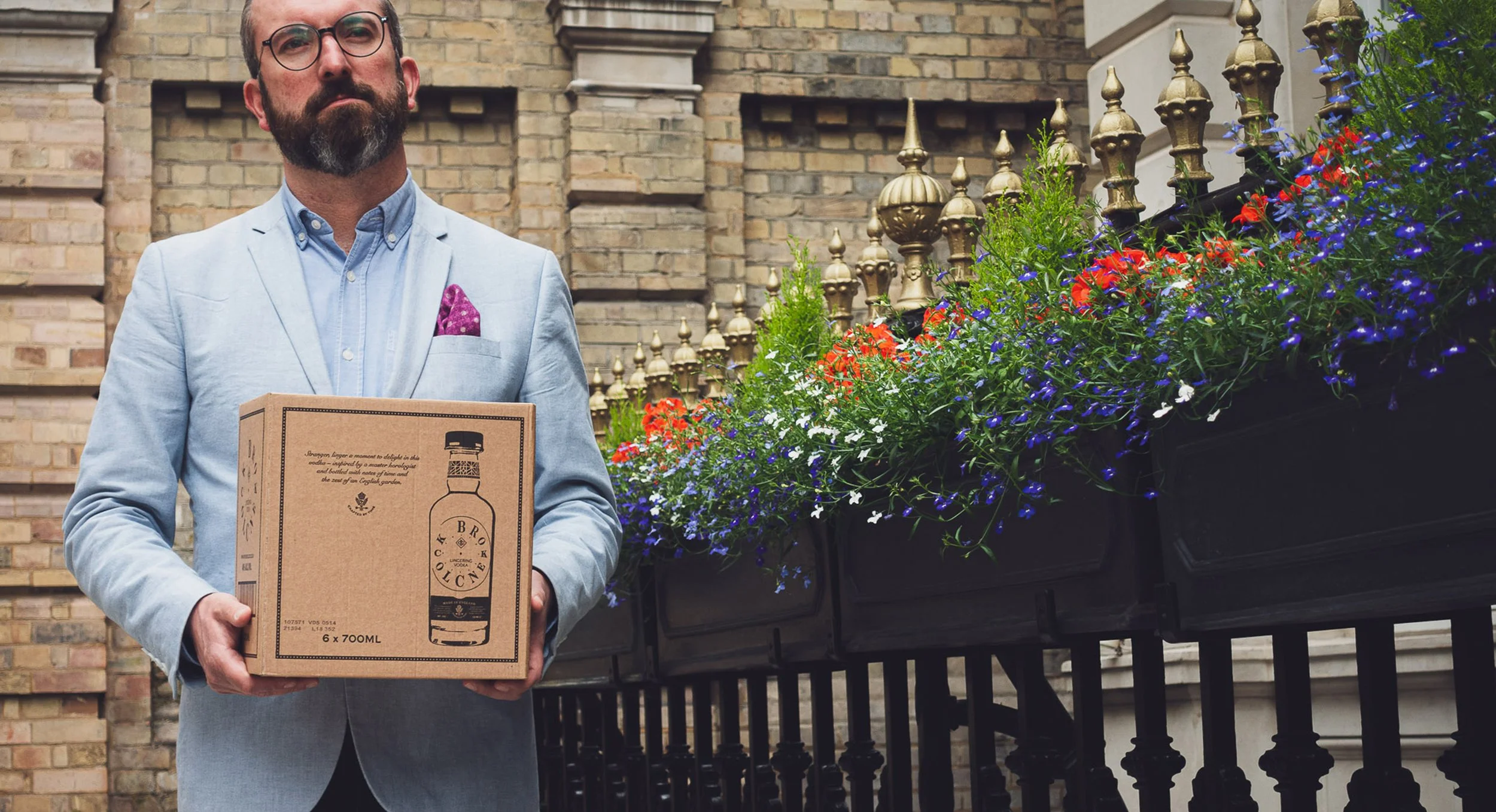
Object of desire: an elegant, keep-me bottle, made to live on the bar cart, not hide in the freezer.
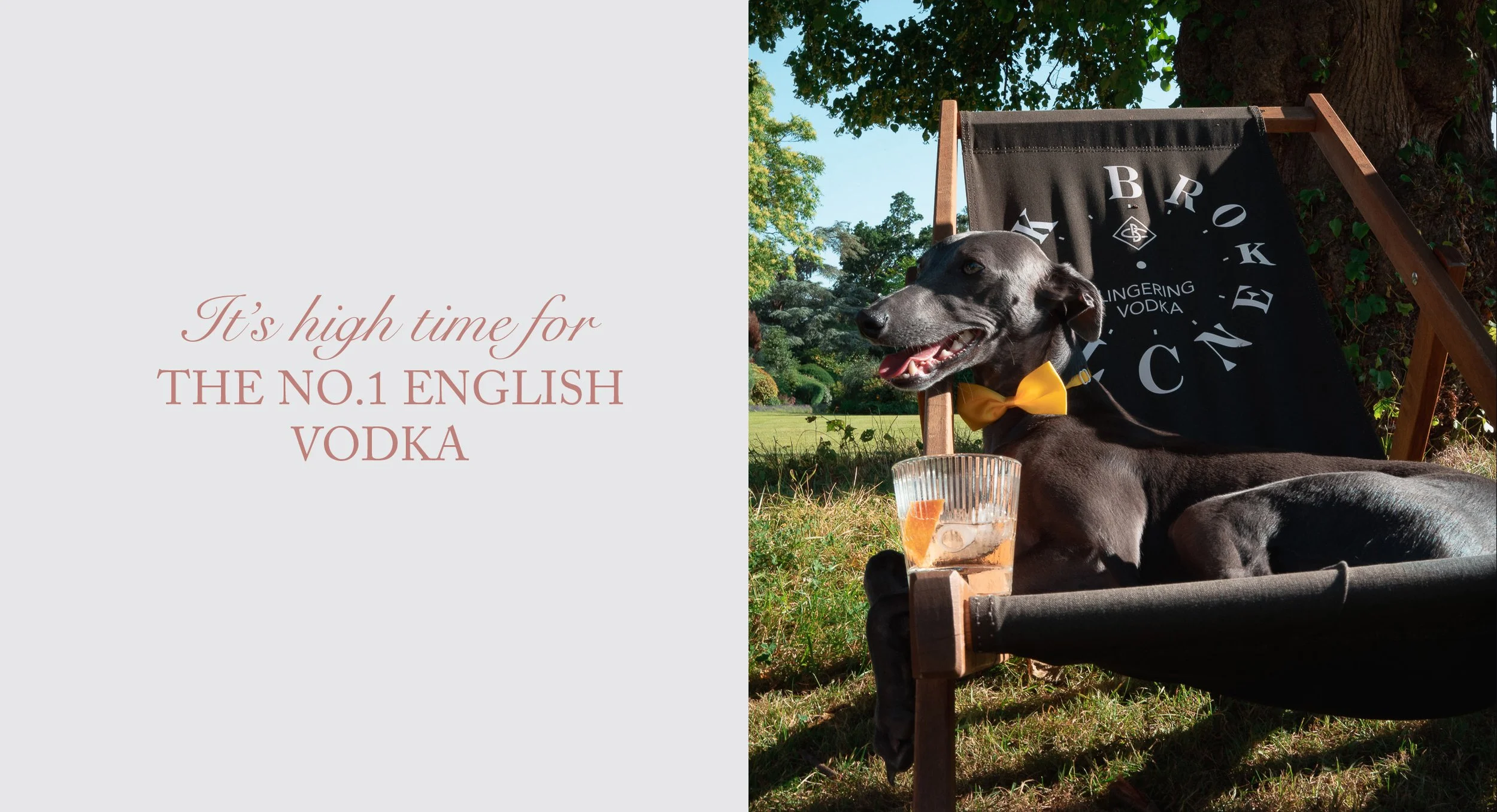
Voice with cadence: celebrate unhurried moments—Bloody Mary at brunch, terrace cocktails, moonlit martinis - so every pour feels unmistakably English.
We handled the whole journey, concept → naming → design → communications, turning “pure” into provenance and making the brand as enjoyable to read as it is to pour.
The Impact
A vodka with something to say, and the craft to back it up. The design festival honored the work, giving trade and consumers an apparent reason to choose (and pay for) the bottle. Broken Clock reframed English vodka as refined, memorable, and confidently premium - time-crafted, place-rooted, finished with British wit.