Amsterdam Navigator — Strength with a Story
The strong beer category sits in a paradox: powerful in flavor yet weak in desirability. Once symbols of confidence and strength, many strong lagers today occupy a stagnant middle ground—neither craft-cool nor mainstream-accessible. Visual codes across the category have become predictable: dark labels, heavy crests, and gothic typography that feel dated rather than daring. With younger audiences shifting toward craft and premium imports, the “strong beer” look no longer signals cool—it signals the past.
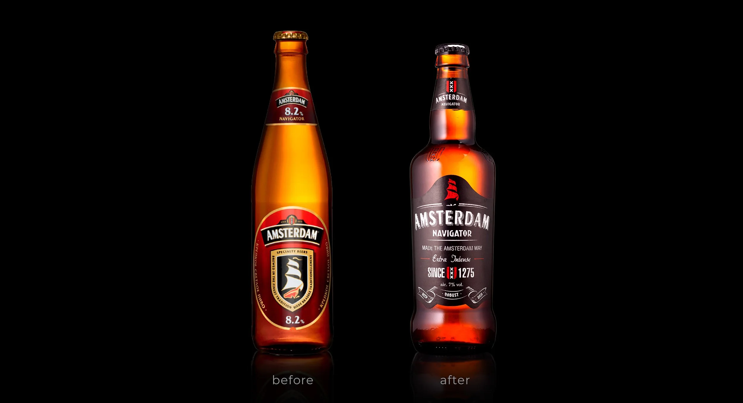
To reignite relevance, Amsterdam Navigator needed more than an update; it needed a visual reframe. The strategy was to borrow from whiskey’s world—a category that embodies maturity, authenticity, and effortless cool. The goal: reclaim credibility and design a strong beer that looked as confident and collectible as a fine spirit.

Our Approach
We reimagined Amsterdam Navigator through the lens of Strength with Freedom. The new identity embraces black and white contrast—symbolizing clarity and power—with red accents to inject boldness and vitality. The iconic sail motif returned as a sign of motion and exploration, paying homage to Amsterdam’s roots while projecting forward energy.
To bridge the worlds of beer and spirits, we built in whiskey and bourbon codes: metallic detailing, embossed finishes, structured label geometry, and a bottle silhouette that feels premium in the hand. The result was packaging that elevated perception, signaling craftsmanship and quality while keeping the rebellious soul intact.

The Impact
The redesign transformed Amsterdam Navigator from a familiar face into a modern flagship. On shelf, it cut through the clutter of generic strong beers and drew in new consumers who saw it not as “heavy,” but as distinctive, confident, and refined. Within months, sales climbed by 14%, validating that a stronger story—and a sharper suit—can revive even a mature category.