Kellogg’s EXTRA — Adding a Little EXTRA to Your Morning
The breakfast cereal market is modest (CAGR ~3–5%), and innovation is often incremental rather than disruptive. In this cluttered, stagnating landscape, premiumization is one of the few levers left for brands to differentiate - offering richer experiences, elevated design, and flavor-driven storytelling that can command attention and justify higher price points.
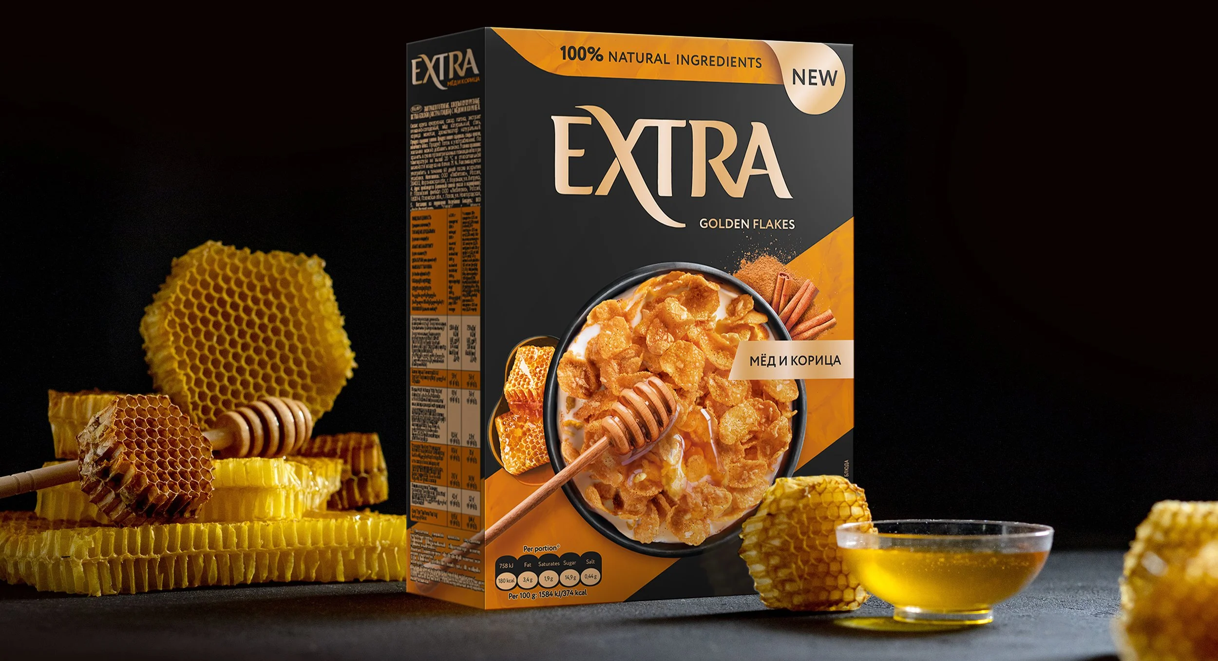
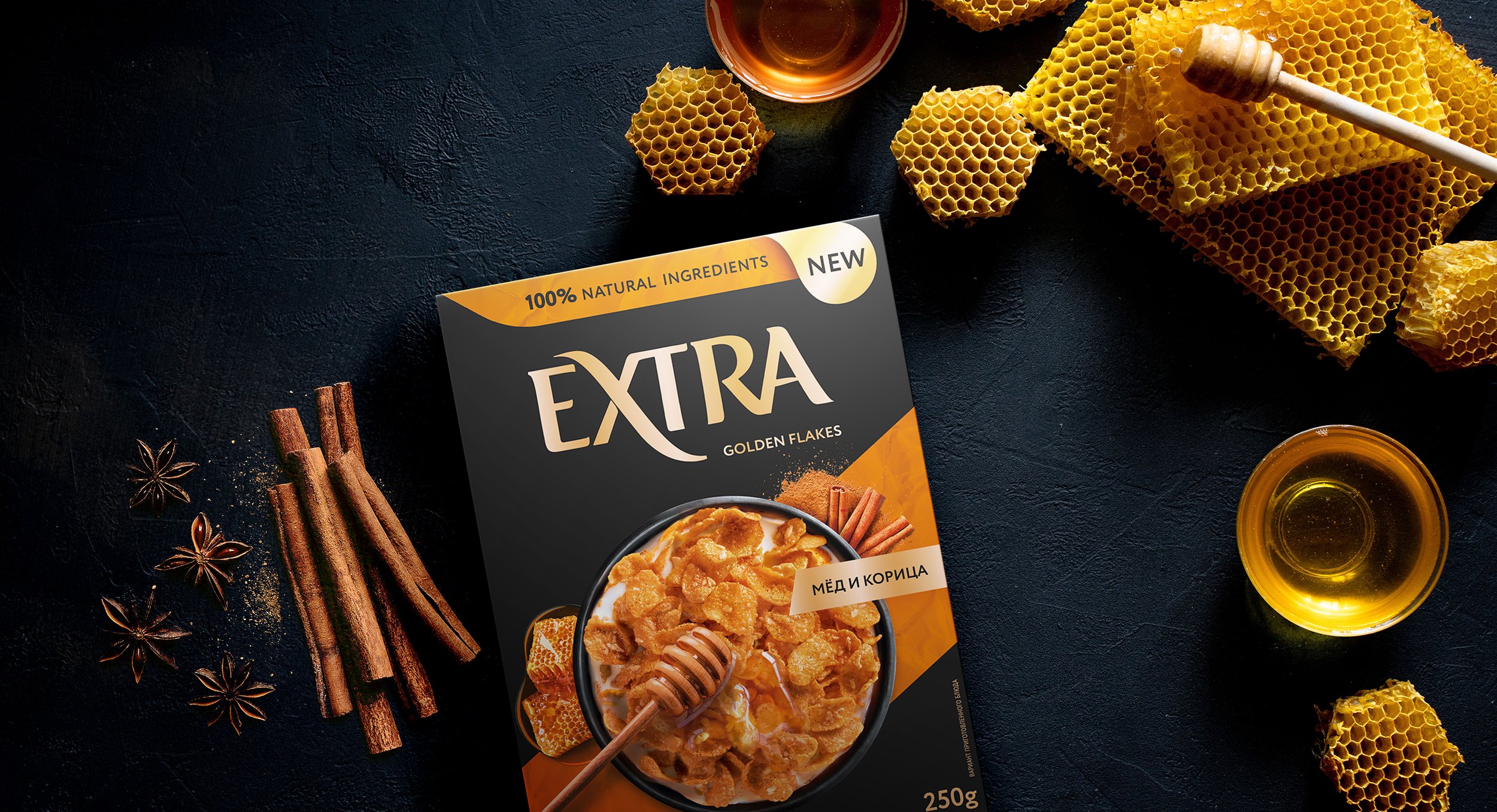
Kellogg’s wanted to position EXTRA not as just another cereal, but as a premium breakfast ritual. Honey & Cinnamon Cornflakes were the opportunity to introduce flavor innovation in a way that felt both accessible and special, with packaging that could signal quality while breaking through on crowded shelves.
Our Approach
We designed a packaging architecture that departs from the loud colors of mainstream cereals. Muted tones and a sleek black backdrop deliver an elevated, premium feel, while also amplifying the golden color of the flakes. The hero shot of the flakes takes center stage, with highly detailed product imagery designed to be irresistible—“more product, more appetite.”
The brand voice balances indulgence with playfulness. EXTRA is framed as a magical moment of the morning: a ritual of self-care for urban consumers who want variety, quality, and flavor. To build consistency across Kellogg’s portfolio, we adapted visual elements from existing EXTRA cookies while evolving them into a format suited for cereal packaging.

The Impact
The result is packaging that feels sophisticated without being distant. The dark palette establishes shelf differentiation, while the golden flakes in the hero shot create appetite appeal and credibility. EXTRA now holds a stronger position as a premium breakfast choice, one that excites curious eaters, reinforces Kellogg’s reputation for quality, and makes the morning ritual feel just a little more extraordinary.