Richard Tea — Classic Roots, Modern Leaves
The premium tea market is crowded with brands that lean heavily on tradition—muted greens, ornate crests, tea cups in steam. Over time, these heritage tropes have created a sea of sameness: packaging that feels safe, muted, and easy to overlook on crowded shelves. Innovation tends to be incremental, and consumers often struggle to tell one “refined” tea from another.
Launching a new tea brand in this landscape is uniquely difficult. Distribution is dominated by established players, consumer perceptions are slow to shift, and loyalty to legacy cues runs deep. To break through, a challenger brand must deliver heritage for credibility while also offering a bold, differentiated design language that makes tea feel fresh, modern, and premium.
Our Approach
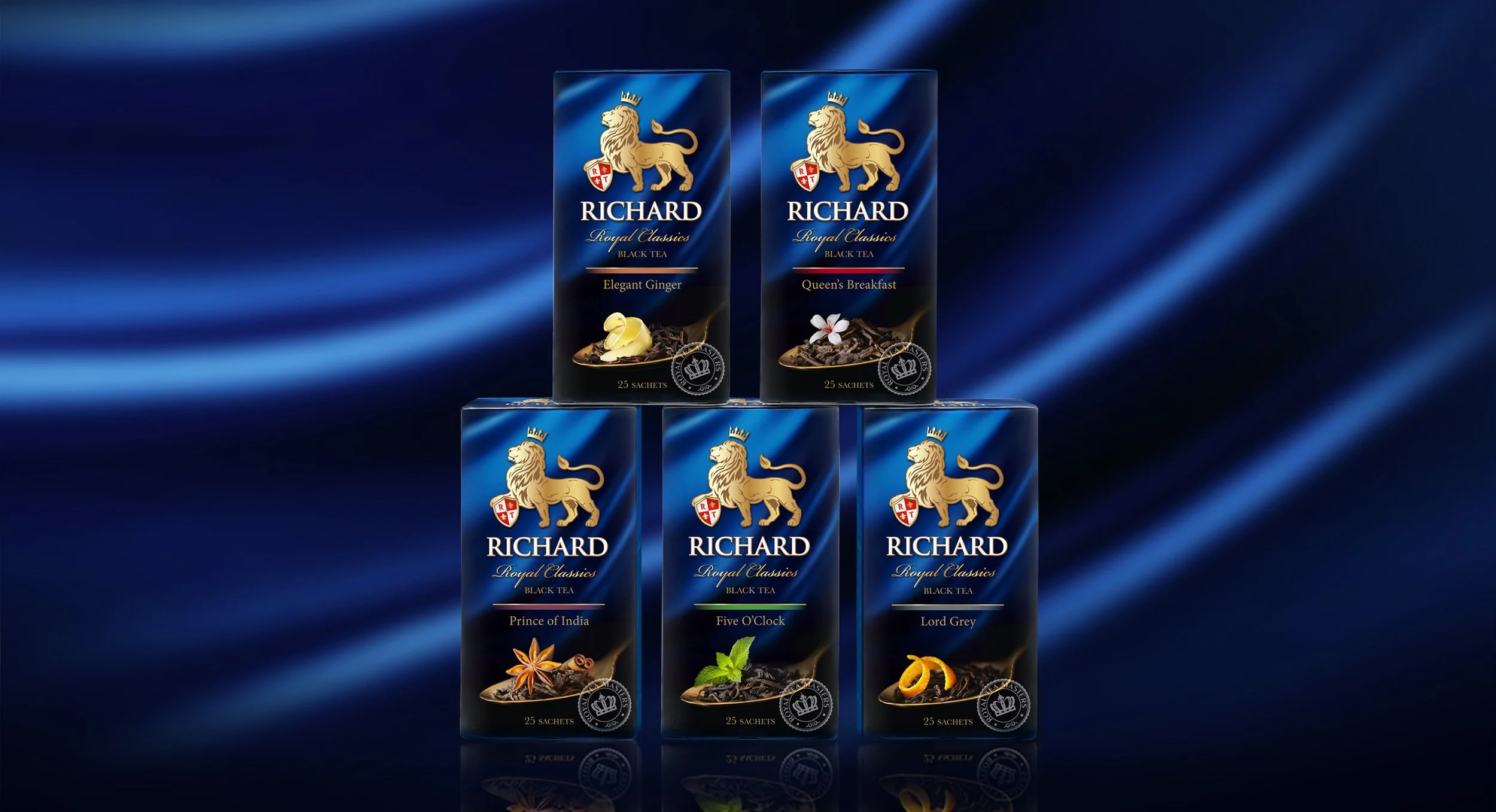
We designed Richard Tea to embrace English heritage while reimagining how premium tea could look. A royal blue palette, lion emblem, and master sommelier’s seal anchor the brand in authority and tradition. But rather than repeating tired tropes, we flipped the script: instead of showing a cup, the hero shot of the leaves takes center stage—textural, fresh, and modern.
This architecture created a deliberate duality: regal yet contemporary, confident yet approachable. By blending cues of authority with bold visual storytelling, Richard signals that premium tea can be both rooted in tradition and relevant to today’s global consumer.
